This is my first illustration for the three wishes story by Kurt Schwitters
It is about a man that had three wishes and for his last wish he wished to be a fish but regretted it straight away as he had the same characteristics of a fish; he couldn't talk or even cry, just swim round like a fish.
The mime face symbolises the fact that he can't speak and so do the pins around the fish as they express the saying 'so quiet you could hear a pin drop'
The strips on the fish might be confusing but they show the fish wearing a stripy shirt like a mime does and dungarees.
The reason why I put houses, crowds and coins on the fish is from his previous wishes- wealth and power
Enjoyed the painting process and will be developing this more
Hope the illustration is more clear from reading this, thanks
Saturday, 31 December 2011
Tuesday, 29 November 2011
New Sam Book
Sam has now changed to a little boy!! I was trying portray the farmer as a younger version of himself
Wednesday, 23 November 2011
Work so far for the Sam project
Theses are the etchings I did, however now I am thinking about changing the character, which I will do by etching into the mental plate that I've got (time consuming but resulting in proper print to display) or drop a new character into photo shop? Whichever I have more time for really
I think the etching that is most successful is the coloured one, as the colours seem to direct the eye more along the illustration, let me know what you think is attractive to look at
Friday, 18 November 2011
Farmer Etching, for Sam project
This is my first drawing that I worked from for my etching
First etching print, the next one I do will be more inked up, so there will be more of a contrast, at the minute all looked a bit grey
Above is the etching plate that I worked into
Friday, 11 November 2011
First Ideas for children's book
My sentence is 'Emerged from the undergrowth and then..'
I started looking into the word 'undergrowth' and the different ways I could interpret it
The different meanings for undergrowth are-
In a child's under grown/overgrown hair- bird house is there (hair looks like a birds nest)
I started looking into the word 'undergrowth' and the different ways I could interpret it
The different meanings for undergrowth are-
1. Low-growing plants, saplings, and shrubs beneath trees in a forest.
2. A growth of short, fine hairs underlying the longer and thicker outer hairs of an animal's coat; underfur or under wool.
3. The condition of being less than fully grown.
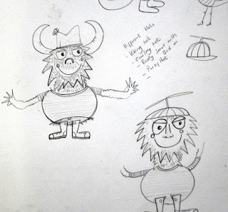
With this is mind I came up with a character
The different scenes I have put the character in so far are
A forest full of under grown/ overgrown tree
In a child's under grown/overgrown hair- bird house is there (hair looks like a birds nest)
Character emerging from underground and appears in the undergrowth of the forest, was deciding whether to put grave yards in?
And my favourite so far, character appearing from a farmers beard, surrounded by farm land and forests
The farmer character and his beard are really rough still
But just wanted to make sure that everyone understand what was happening and if the illustration goes with my sentence 'emeraging from the ungrowth' or not?
Its hard to see the character but his in the beard near the wind mill
Monday, 7 November 2011
How to undo
Screen print on patterned paper which looks like a wedding invitations, thinking about high lighting different elements with cream?
The idea behind the editorial is how you can undo a wedding.. so there are ripped up pieces of photos from the wedding album
This is another print I did but just on normal white paper, think the patterned paper gives it something more, gives another element to the piece
How to be conceited
Screen print, with changes on photoshop to highlight different elements for them to jump out at you
Below are the original prints on different paper and materials
Small victories
This is my final for the editorial, a screen print on graph paper, with white highlights on the image added on photoshop to draw the eye in to different parts of the illustration
Keep changing my mind about the two illustrations, am learning more towards the blue and green one (above) than the blue and purple one (below)
However with the purple coloured one the pens shoes and other little elements show up better
Below are the prints that I did with different colours
Keep changing my mind about the two illustrations, am learning more towards the blue and green one (above) than the blue and purple one (below)
However with the purple coloured one the pens shoes and other little elements show up better
Below are the prints that I did with different colours
Monday, 31 October 2011
How to be conceited
So for this piece I've created a character with a big head (which I think am going to make even bigger) as they are very big headed about themselves, they are also surrounded by different types if mirrors because they love to look at themselves, at the minute the character looks a bit of a 'mummies boy' so need to harden him up a bit and change the knitted cardie to vest maybe or polo shirt?
Small Victories.. Continued
Going with the character in glasses now, need to develop the illustrations on the tie more, better to have them in a list 1. 2. 3. than placed randomly, might be easier to follow... Need to make the ticks stand out more, maybe have the ticks slightly out of the tie
Monday, 24 October 2011
New Spam
Made the colours stand out more and the text closer to the central illustration
Does it look better with a boarder? Maybe try a blue colour later, but don't want it to look too cold?
Sunday, 23 October 2011
Edited Spam advert
I put my poster on photoshop to bring the text and the central illustration closer together, however not happy with the line I've got on the top of the page where the colour of the paper changes where I've cropped it and layed it up
Can anyone help and tell me how you can blend the background colours together?
Friday, 21 October 2011
Ideas for 'why small victories matter'
For a starting point on the new brief I highlighted a line which says 'the challenge, on a personal level, is remembering to notice the smaller things you've achieved. Keeping a 'done list' as well as a 'to do list'
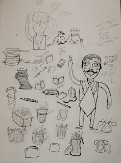
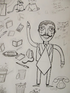
This sparked ideas of a business man with a done list, however I think just a business writing a a 'done list' would not be visually interesting, so I thought it would be more interesting if a illustrated what the man have done that day with illustrations on his tie...... A 'Done tie'....
Here are my first drawings for the project
So on the tie, the things that the man has done so far are.... walking the dog, feeding the cat, washing the pots, hanging washing out, do the ironing, taking the bins out
Then to relate it more to the business side of it, there are pens, pencils, laptops, books etc
I think I prefer the tie that's moving rather than the one that isn't?
So next step is to fit it in a 100 mm x 105 mm square
Was thinking if its difficult to see the illustration on the tie then have it all over his suit instead, meaning that the illustrations will be bigger, be able to see them more clearer?
Thursday, 20 October 2011
Subscribe to:
Posts (Atom)


