So for this piece I've created a character with a big head (which I think am going to make even bigger) as they are very big headed about themselves, they are also surrounded by different types if mirrors because they love to look at themselves, at the minute the character looks a bit of a 'mummies boy' so need to harden him up a bit and change the knitted cardie to vest maybe or polo shirt?
Monday, 31 October 2011
Small Victories.. Continued
Going with the character in glasses now, need to develop the illustrations on the tie more, better to have them in a list 1. 2. 3. than placed randomly, might be easier to follow... Need to make the ticks stand out more, maybe have the ticks slightly out of the tie
Monday, 24 October 2011
New Spam
Made the colours stand out more and the text closer to the central illustration
Does it look better with a boarder? Maybe try a blue colour later, but don't want it to look too cold?
Sunday, 23 October 2011
Edited Spam advert
I put my poster on photoshop to bring the text and the central illustration closer together, however not happy with the line I've got on the top of the page where the colour of the paper changes where I've cropped it and layed it up
Can anyone help and tell me how you can blend the background colours together?
Friday, 21 October 2011
Ideas for 'why small victories matter'
For a starting point on the new brief I highlighted a line which says 'the challenge, on a personal level, is remembering to notice the smaller things you've achieved. Keeping a 'done list' as well as a 'to do list'
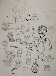
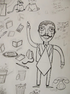
This sparked ideas of a business man with a done list, however I think just a business writing a a 'done list' would not be visually interesting, so I thought it would be more interesting if a illustrated what the man have done that day with illustrations on his tie...... A 'Done tie'....
Here are my first drawings for the project
So on the tie, the things that the man has done so far are.... walking the dog, feeding the cat, washing the pots, hanging washing out, do the ironing, taking the bins out
Then to relate it more to the business side of it, there are pens, pencils, laptops, books etc
I think I prefer the tie that's moving rather than the one that isn't?
So next step is to fit it in a 100 mm x 105 mm square
Was thinking if its difficult to see the illustration on the tie then have it all over his suit instead, meaning that the illustrations will be bigger, be able to see them more clearer?
Thursday, 20 October 2011
Monday, 10 October 2011
Second Year Work
I know I'm posting backwards here but I thought while I can't sleep I'll post some of my second year work
 This is a piece that was called 'even odd numbers have countless fun' the concept behind this was that all of the illustrations are relating to an odd number (three legged dog, love triangle, three blind mice etc..)
This was the piece that got me into the print room and I never really left since!!! Done in lino
These are screen prints of a project that I did called 'pet problems'- the prints went really well and I was very happy with the end result, below are the just the illustations
And here are the illustration with their titles, the lettering is done with letter stamps and purple ink

This was the piece that got me into the print room and I never really left since!!! Done in lino
These are screen prints of a project that I did called 'pet problems'- the prints went really well and I was very happy with the end result, below are the just the illustations
This is my undermilkwood project, the first screen print that I ever did!!!
After many MANY hours in the print room and many mistakes made this was produced
I now understand how ambitious this was with my first screen print, however I think it's a good lesson to learn from your mistakes and with this project a lot was made!!!!
Finals for Cocktail Partyy!!!!!
After hours and hours in the print room my pieces are finally done!!!! Whooop!!!!
Here are just two of the finished pieces on different coloured paper (I've got more to post soon)
Am leaning more towards the dark brown one?
This is half of my screen print on grey paper, my initial idea was to photoshop my other characters onto the final print, but when I slept on it, I decided to screen print them all as I didn't want my print to be too busy.
I wanted my final to have limited colour and believe this was achieved
Tuesday, 4 October 2011
Subscribe to:
Comments (Atom)


